If you thought that all the graphs in Graph Mode wasn't enough - we added more! Yes, that's right! We added more graphs for you to to check out, so more data for you to look into!
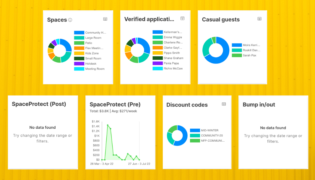
You can find them under your Bookings tab and click "Graphs" in "View Mode".
But wait! There's more...
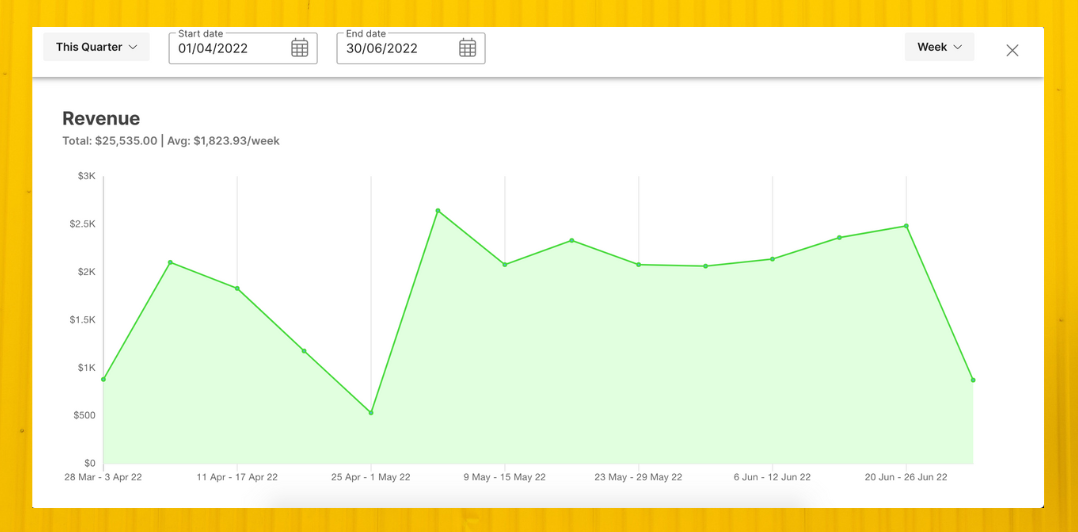
You can expand your graphs so you can see all the data better and it's as easy as clicking the icon on the top right corner of the graph.
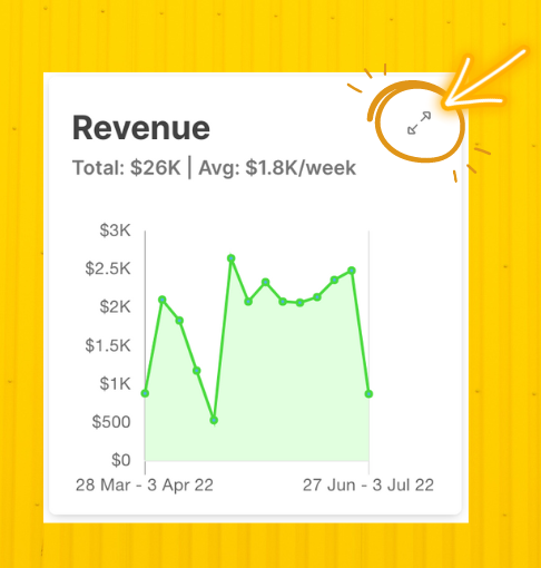
No more squinting and trying to look at how your data is doing or scratching your head to figure out how you can better understand your data. Simply expand it and you can change your data set on the top.
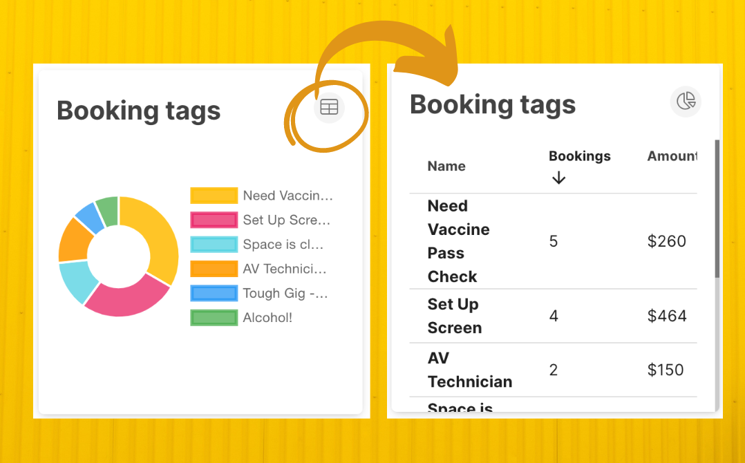
Speaking of other icons on the top right corner. Another update is that you can now view your pie charts as a table. If you're not one to look at different colours, or don't understand pie charts... or don't like pies... or charts, easy! (No judgement here). Just change it to turn it into a table instead.
Again, simply hover over the pie chart and click the table icon on the top right corner and voilà!
Now, accessing more data to help you better understand how your spaces are being used is made available! And if you're feeling you want to reference these graphs on paper - you can now also print these graphs with a single click. Check out the print icon right at the top!
-2.png?width=1079&name=Graphics%20for%20blog%20posts%20(1)-2.png)
To watch these graphs and features in action, click the video below: